1990s vs. 2010s - Which Expansion Will be Better for Gold? / Commodities / Gold & Silver 2019

 Ladies andGentlemen, we have a tie! The current expansion already lasts as long as the economic boom that started in March 1991 and endedin March 2001. We invite youto read our today’s article, which compares both expansions and find out whetherthe current boom will be better for gold than the 1990s.
Ladies andGentlemen, we have a tie! The current expansion already goes on 120 months, the same as the economic boom lasting from March1991 to March 2001. However, inthe previous edition of the Market Overview, we suggested that the currentexpansion still has room to run. Afterall, the ongoing boom is very long, but this is because it is very weak. If theUS economy is to replay the robust recovery of the 1990s in terms of GDP growthand not merely in terms of number of months, it could grow for additionalcouple of years.
Now, let’scompare our growth leaders in a more detailed way and draw valuable conclusions for the economic outlook and the gold market.
Chart 1:Current vs. economic expansion in the 1990s compared in terms of real GDP(green bars), industrial production (blue bars) and real incomes (red bars)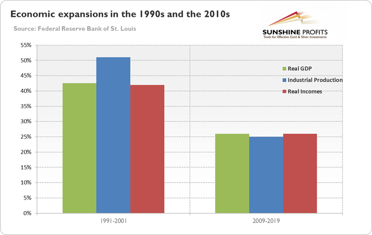
As one can seein the chart above, although both expansions lasted the same time – 120 months– the boom of the 1990s was much stronger. Indeed, the real GDP and real incomesoared more than 40 percent, while industrialproduction surged more than 50 percent over the decade. In contrast, all three measuresincreased just about 25 percent in the 2010s. It means that the current expansionis much weaker. In part this is completely understandable, because as time goes by and economy advances it is harderfor maintaining a fast growth rate. Butstill the sluggish growth is disturbing, with the exception of the gold bulls who should welcome it.
Let’s move on now todiscuss the US labor market. As one can see in the chart below, the unemployment rate at 3.6 percent iscurrently below the bottom of the 1990s (3.8 percent), although the currentexpansion started which higher unemployment rate than the formerexpansion.
Chart 2: USunemployment rate (red line, left axis, U3, in %) and the labor force participationrate (blue line, right axis, in %) from March 1991 to April 2019.
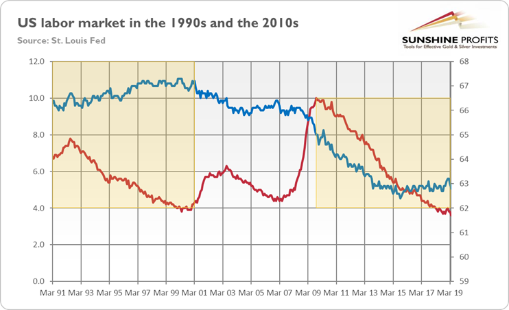
However, thelabor participation rate is significantly lower than in the 1990s, as itdeclined from about 67 to 63 percent. Itindicates that the labor market slack is greater than the unemployment ratesuggests. Indeed, the U-6 unemployment rate, which includes also allmarginally attached workers plus total employed part time for economic reasons,is at 7.3 percent, a 0.5 percentage point above the through of 6.8 percent inOctober 2000. If indeed the labor market slack is greater than commonlybelieved (which would explain the sluggish wage growth), than economic expansion can last longer without overheating.
Let’s comparenow inflation in the 1990s and currently. As the chart belowshows, inflation rate has been recently significantly lower – more than 1percentage point, on average – than in the 1990s. Then, there was a disinflation, so gold struggled. Since the GreatRecession, inflationrate stabilized, but at stubbornly low level.
Chart 3: US CPI rate (as % from a year ago) from March 1991to April 2019.
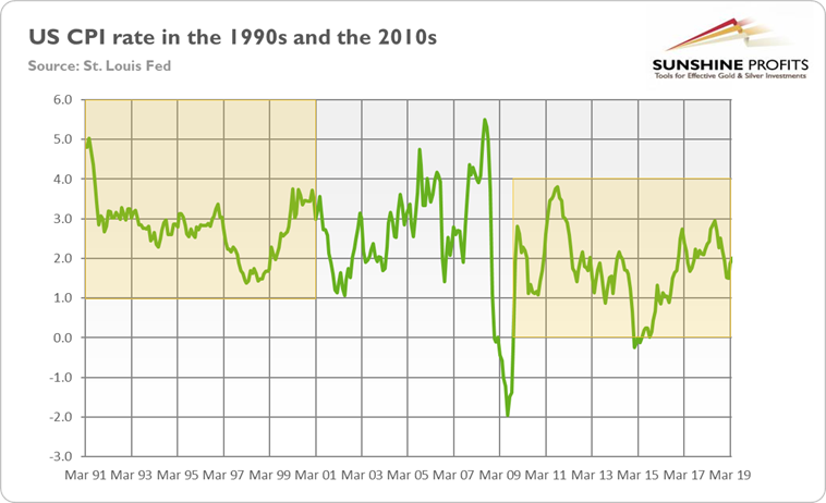
Gold, which is considered to be inflation hedge, does not like lowinflation. Although lowinflation also means more dovishFed and lowernominal interestrates, it allows theGoldilocks economy to last.
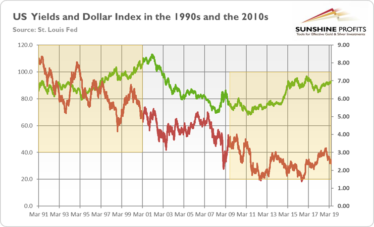
Indeed, thechart below shows that the nominal long-term yields are significantly lowerthan in the 1990s. Similarly, the greenback’s strength is weaker than 20-30years ago. It suggests that the currentexpansion has still more room to run.
Chart 4: US Long-Term Nominal Interest Rates (red line,right axis, 10-year Treasury yields, in %) and the Trade Weighted US DollarIndex (green line, left axis, against major currencies) from March 1991 toApril 2019.
What does itall mean for the gold market? Well, themacroeconomic environment in the 1990s was much worse for the yellow metal. The GDP was rising quickly, while the labor market was strengthening. Inflationwas decreasing, while the US dollar was strong and appreciating in the secondhalf of the 1990s. The US fiscalpolicy wastightening, while the Fed was lifting the federalfunds rate in 1993-95, as one can see in the chart below.
Chart 5: Federal deficit (green line, as % of GDP) and the effectivefederal funds rate (red line, annual average, %) from 1991 to 2018.
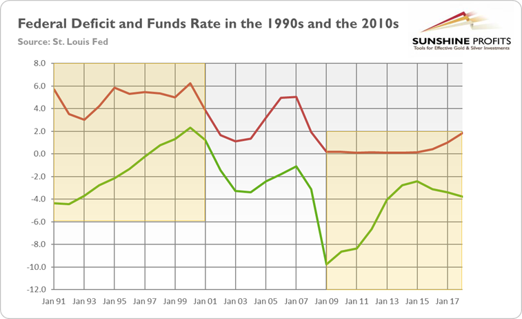
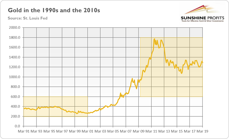
Notsurprisingly, gold struggled in the1990s. The current expansion – despite the fact that gold has been recentlyin a sideways trend – has been much better for the price of the yellowmetal, as the chart below clearly shows.
Chart 6: Gold prices (London P.M. Fix, in $) from March 1991to April 2019.
But what doesit imply for the future? First of all, our analysis confirm the view that –given the level of slack in the labor market and low inflation – the current expansion could continue for awhile. This is bad news for gold. But we have also good news. In the 1990s,the economy grew strongly despite Clinton’s fiscal surpluses and Fed’stightening in 1993-95. Now, the economy expands slowly even when supported bythe Trump’s fiscaldeficits and the Fed’s ZIRP that lasted until December 2015. It doesn’t bode well for thefuture for the economy in the long term, but it fills the gold bulls withoptimism. After all, goldremains in the sideways trend not without a reason: the Goldilocks economyfeels good right now, but it might jump out the window later.
Thank you.
If you enjoyed the above analysis and would you like to knowmore about the gold ETFs and their impact on gold price, we invite you to readthe April MarketOverview report. If you're interested in the detailed price analysis andprice projections with targets, we invite you to sign up for our Gold & SilverTrading Alerts . If you're not ready to subscribe at this time, we inviteyou to sign up for our goldnewsletter and stay up-to-date with our latest free articles. It's freeand you can unsubscribe anytime.
Arkadiusz Sieron
Sunshine Profits‘ MarketOverview Editor
Disclaimer
All essays, research and information found aboverepresent analyses and opinions of Przemyslaw Radomski, CFA and SunshineProfits' associates only. As such, it may prove wrong and be a subject tochange without notice. Opinions and analyses were based on data available toauthors of respective essays at the time of writing. Although the informationprovided above is based on careful research and sources that are believed to beaccurate, Przemyslaw Radomski, CFA and his associates do not guarantee theaccuracy or thoroughness of the data or information reported. The opinionspublished above are neither an offer nor a recommendation to purchase or sell anysecurities. Mr. Radomski is not a Registered Securities Advisor. By readingPrzemyslaw Radomski's, CFA reports you fully agree that he will not be heldresponsible or liable for any decisions you make regarding any informationprovided in these reports. Investing, trading and speculation in any financialmarkets may involve high risk of loss. Przemyslaw Radomski, CFA, SunshineProfits' employees and affiliates as well as members of their families may havea short or long position in any securities, including those mentioned in any ofthe reports or essays, and may make additional purchases and/or sales of thosesecurities without notice.
Arkadiusz Sieron Archive |
© 2005-2019 http://www.MarketOracle.co.uk - The Market Oracle is a FREE Daily Financial Markets Analysis & Forecasting online publication.