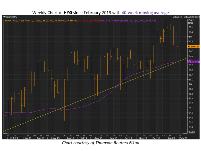
Chart for Bond ETF HYG Signals Entry Point for Stock Bulls
 HYG has pulled back to a notable trendline
We've been gauging the recent pullback in stocks that's come mostly at the hands of the coronavirus outbreak. The Dow Jones Industrial Average (DJI) is pacing for a nearly 200-point drop today, eyeing a second straight weekly loss, but from one perspective this pullback could be an entry point for bulls.
For instance,Schaeffer's Senior Options Strategist Bryan Sapp just pointed out that the iShares iBoxx USD High Yield Corporate Bond ETF (HYG) is trading near a trendline of higher lows that has proven to show when it's a good time to go long stocks. You can see that the 40-week moving average is now moving up alongside this trendline, as well. What's more, the ETF's chart pattern from there gets even more bullish, since Sapp noticed it's formed an ascending triangle pattern.
It's not a direct correlation, but generally an upward move from HYG is good for stocks. Considering that, you can take this as at least one positive sign that stocks could be in store for another push higher in the coming weeks.
