Gold/Dollar- Monster breakout test in play!
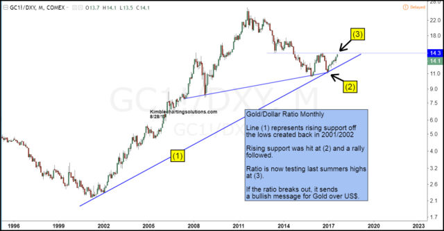
The Gold/Dollar chart below reflects that Gold was much stronger than the U.S. Dollar (US$) from 2001 until 2011. Since 2011, the US$ has been stronger than Gold, as the ratio has declined for 6-years. Is it time for the worm to turn (Gold stronger than US$)? The ratio below reflects a big test is in play, that could answer this very important question.
CLICK ON CHART TO ENLARGE
The Gold/US$ ratio hit rising support line (1) at (2) earlier this year, which held and a rally then followed, as the US$ hit a high and Gold has rallied. This pattern could be part of a bullish ascending triangle that is forming. The top of this potential pattern is being tested this month at (3).
If the ratio breaks out at (3), Gold, Silver and miners could do very well!
Over the past 100-days, Premium and Metals members have liked the looks of Copper and Freeport Mcmoran. FCX which was purchased and it has been much stronger than Copper, Gold, Silver and the S&P 500. If the ratio does breakout above, it would send a positive message for the metals space that is has not seen in a couple of years!
CLICK ON CHART TO ENLARGE
Should the ratio breakout at (3) in the top chart, Gold, Silver and Miners could attract buyers and push them much higher!
If you would like to receive daily and weekly updates on Gold, Silver, Copper and Miners, we would be honored if you were a Premium or Metals member.


