Gold Miners: Why Apparent Strength is Just a Facade / Commodities / Gold and Silver Stocks 2021

Despite everyone saying the bottom isin, and that gold and miners are set for takeoff, the signs still point south.The real question: how low can they go?
Let’s take a look at some price targetsfor where the GDX and GDXJ mining ETFs might land up.
With the miners attempting to reclaimPride Rock, it won’t be long until the GDX ETF is singing Hakuna Matata.
Rising U.S. Treasury yields? No problem.
A reinvigorated USD Index? Who cares.
But while strength is often viewedthrough the eyes of the beholder, the GDX ETF is far from being The Lion King.Sure, its bravery in the face of familiar foes is reason for optimism. However,we’ve seen this movie before. While the recent rally may resemble Mufasa,beneath the surface, the GDX ETF’s tepid price action looks a lot like Simba.
If you analyze the chart below, you cansee that the GDX ETF moved to the upper level of my initial target range.However, with the Mar. 19 close eliciting a sell signal from the stochasticoscillator (the black and red lines at the bottom section of the chart), ahistorical reenactment (repeat of the early-2021 performance) could deliveranother sharp move lower.
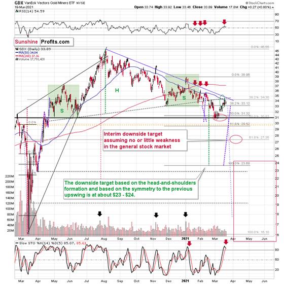
In addition, the shape of theearly-January swoon is eerily similar to today’s price action. Case in point:back in January, the GDX ETF enjoyed a material daily rally, consolidated , then sunk like a stone.Because of that, the recent move higher and a few days of back-and-forthtrading ( consolidation ) is nothingto write home about.
To explain, I wrote on Mar. 18:
Miningstocks followed gold higher, and they moved to the upper part of my previoustarget area, but not yet to its upper border. As you may recall, I mentionedthe possibility of GDX moving to the $34 - $35 area and my original target forthis rally was slightly below $34.
TheGDX ETF now encountered the strongest combination of resistance areas, whilethe Stochastic indicator moved above the 80-level. Technically, the situationis now much more bearish in the GDX ETF chart than it was at the beginning ofthe year. Back in January, the GDX ETF was only at the declining blueresistance line.
Now,in addition to being very close to the above-mentioned line it’s also at:The neck level of the previously broken broad head and shoulderspatternThe 50-day moving averageThe previous (late-February) highs.
Consequently,it’s highly likely that we’ve either just seen a top or one is close at hand.
But if we’re headed for a GDX ETF cliff,how far could we fall?
Well, while the S&P 500 is a keyvariable in the equation, there are three reasons why the GDX ETF might form aninterim bottom at roughly ~$27.50 (assuming no big decline in the general stock market ):
Keep in mind though: the interim downside target is based on theassumption of a steady S&P 500 . If the stock market plunges, all betsare off. For context, when the S&P 500 plunged in March 2020, the GDX ETFfell below $17, and it took less than two weeks for it to move as low from$29.67. As a result, U.S. equities have the potential to make the miners’forthcoming swoon all the more painful.
If gold forms an interim bottom close to$1,600, this could also trigger a corrective upswing in the mining stocks, butit’s too early to say for sure whether that’s going to be the case or not.
Also supporting the potential move, theGDX ETF’s head and shoulders pattern – marked by the shaded green boxes above –signals further weakness ahead.
I wrote previously:
Eversince the mid-September breakdown below the 50-day movingaverage , the GDX ETF was unable to trigger a substantial and lasting move above this MA. Thetimes when the GDX was able to move above it were also the times when thebiggest short-term declines started.
(…)
Themost recent move higher only made the similarity of this shoulder portion ofthe bearish head-and-shoulderspattern to the left shoulder) bigger. This means that whenthe GDX breaks below the neck level of the pattern in a decisive way, theimplications are likely to be extremely bearish for the next several weeks ormonths.
Turning to the juniorgold miners , the GDXJ ETF will likely be the worst performer duringthe upcoming swoon. Why so? Well, due to its strong correlation with theS&P 500, a swift correction of U.S. equities will likely sink the juniorsin the process.
What’s more, erratic signals from theMACD indicator epitomizes the GDXJ ETF’s heightened volatility.
Please see below: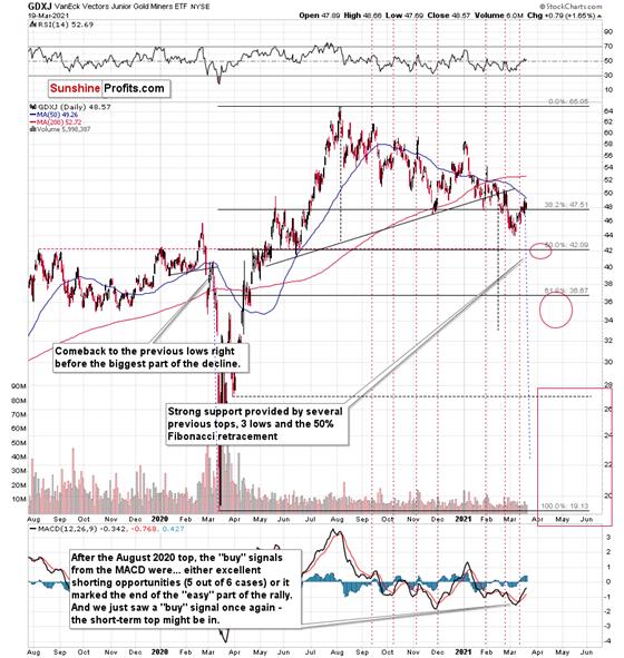
To explain, I wrote on Mar. 12:
Theabove chart is a big red warning flag for beginnerinvestors . The flag reads:“verify the efficiency of a given tool on a given market, before applying it”.
Thebottom part of the above chart features the MACDindicator . Normally, when the indicator line (black) crosses itssignal line (red), we have a signal. If it’s moves above the signal line, it’sa buy sign, and if it moves below it, it’s a sell sign.
But.
Ifone actually looks at what happened after the previous “buy signals” in therecent months, they will see that in 5 out of 6 cases, these “buy signals”practically marked the exact tops, thus being very effective sell signals! Inthe remaining case, it was a good indication that the easy part of thecorrective upswing was over.
I’mnot only describing the above due to its educational value, but because we actually saw a “buy signal” from the MACD, which was quitelikely really a sell signal.
More importantly though, the MACDindicator is far from a light switch. While false buy signals often precedematerial drawdowns, the reversals don’t occur overnight. As a result, it’sperfectly normal for the GDXJ ETF to trade sideways or slightly higher for afew days before moving lower. This is what we saw last week
But how low could the GDXJ ETF go?
Well, just like the GDX ETF, the S&P 500 is an important variable . However, absent an equity rout, the juniors could form an interim bottom inthe $34 to $36 range and if the stocks show strength, juniors could form theinterim bottom higher, close to the $42.5 level. For context, theabove-mentioned ranges coincide with the 50% and 61.8% Fibonacci retracementlevels and the GDXJ ETF’s previous highs (including the late-March/early-Aprilhigh in case of the lower target area). Thus, the S&P 500 will likely needto roll over for the weakness to persist beyond these levels.
Some people (especially the permabullsthat have been bullish on gold for all of 2021, suffering significant losses –directly and in missed opportunities) will say that the final bottom is alreadyin. And this might very well be the case, but it seems highly unlikely to me.On a side note, please keep in mind that I’m neither a permabull nor apermabear for the precious metals sector, nor have I ever been. Let meemphasize that I’m currently bearish(for the time being), but earlier this month, we went long mining stocks onMarch 4 and exited this trade on March 11.
Another reason (in addition to themyriads of signals coming not only from mining stocks, but from gold, silver,USD Index, stocks, their ratios, and many fundamental observations) is thesituation in the GoldMiners Bullish Percent Index ($BPGDM), which is not yet at thelevels that triggered a major reversal in the past. The Index is now back above 27. However, far from amedium-term bottom, the latest reading is still more than 17 points above the2016 and 2020 lows.
Backin 2016 (after the top), and in March 2020, the buying opportunity didn’tpresent itself until the $BPGDM was below 10.
Thus, with sentiment still relativelyelevated, it will take more negativity for the index to find the true bottom.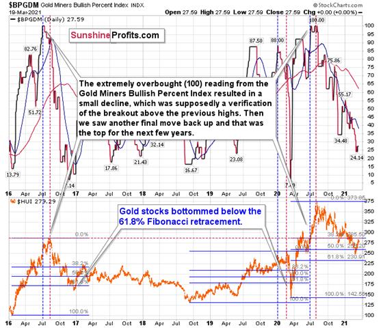
Theexcessive bullishness was present at the 2016 top as well and it didn’t causethe situation to be any less bearish in reality. All markets periodically getahead of themselves regardless of how bullish the long-term outlook really is.Then, they correct. If the upswing was significant, the correction is alsoquite often significant.
Pleasenote that back in 2016, there was an additional quick upswing before the slideand this additional upswing had caused the $BPGDM to move up once again for afew days. It then declined once again. We saw something similar also in themiddle of 2020. In this case, the move up took the index once again to the 100level, while in 2016 this wasn’t the case. But still, the similarity remainspresent.
Backin 2016, when we saw this phenomenon, it was already after the top, and rightbefore the big decline. Based on the decline from above 350 to below 280, weknow that a significant decline is definitely taking place.
Buthas it already run its course?
Well, in 2016 and early 2020, the HUIIndex continued to move lower until it declined below the 61.8% Fibonacci retracement level. The emphasis goes on“below” as this retracement might not trigger the final bottom. Case in point:back in 2020, the HUI Index undershot the 61.8% Fibonacci retracement level andgave back nearly all of its prior rally. And using the 2016 and 2020 analoguesas anchors, this time around, the HUI Index is likely to decline below 231. Inaddition, if the current decline is more similar to the 2020 one, the HUI Indexcould move to 150 or so, especially if it coincides with a significant drawdownof U.S. equities.
Moreover, let’s keep in mind that anunwinding of NASDAQ speculation could deliver a fierce blow to the gold miners. Back in 2000, when the dot-combubble burst, the NASDAQ lost nearly 80% of its value, while goldminers lost more than 50% of their value.
Please see below: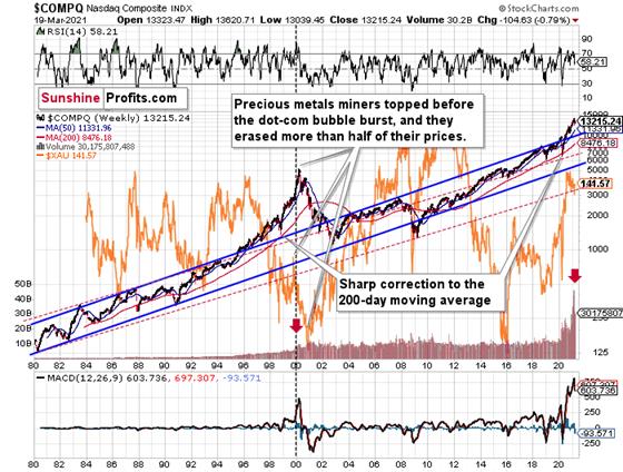
Rightnow, the two long-term channels above (the solid blue and red dashed lines)show that the NASDAQ is trading well above both historical trends.
Backin 1998, the NASDAQ’s last hurrah occurred after the index declined to its200-day moving average (which was also slightly above the upper border of therising trend channel marked with red dashed lines).
Andwhat happened in the first half of 2020? Well, we saw an identical formation.
Thesimilarity between these two periods is also evident if one looks at the MACDindicator . There has been no other, even remotely similar,situation where this indicator would soar so high.
Furthermore,and because the devil is in the details, the gold miners’ 1999 top actuallypreceded the 2000 NASDAQ bubble bursting. It’s clear that miners (the XAUIndex serves as a proxy) are on the left side of the dashed verticalline, while the tech stock top is on its right side. However, it’s important tonote that it was stocks’ slide that exacerbated miners’ decline. Right now, themining stocks are already declining, and the tech stocks continue to rally. Twodecades ago, tech stocks topped about 6 months after miners. This might spoilthe party of the tech stock bulls, but miners topped about 6 months ago…
Alsosupporting the 2000 analogue, today’s volume trends are eerily similar. If youanalyze the red arrows on the chart above, you can see that the abnormal spikein the MACD indicator coincided with an abnormal spike in volume. Thus,mounting pressure implies a cataclysmic reversal could be forthcoming.
Interestingly,two decades ago, miners bottomed more or less when the NASDAQ declined to itsprevious lows, created by the very first slide. We have yet to see the “firstslide” this time. But, if the history continues to repeat itself and techstocks decline sharply and then correct some of the decline, when they finallymove lower once again, we might see THE bottom in the mining stocks. Of course,betting on the above scenario based on the XAU-NASDAQ link alone would not bereasonable, but if other factors also confirm this indication, this couldreally take place.
Eitherway, the above does a great job at illustrating the kind of link between thegeneral stock market and the precious metals market that I expect to see alsothis time. PMs and miners declined during the first part of the stocks’ (here:tech stocks) decline, but then they bottomed and rallied despite thecontinuation of stocks’ freefall.
Even more ominous, the MACD indicator is now eliciting a clearsell signal . And displaying a reading that preceded the dot-com bust in2000, the NASDAQ Composite – and indirectly, the PMs – continue to sail towardthe perfect storm.
As further evidence, the HUI Index/S&P 500 ratio has broken below critical support.
Please see below: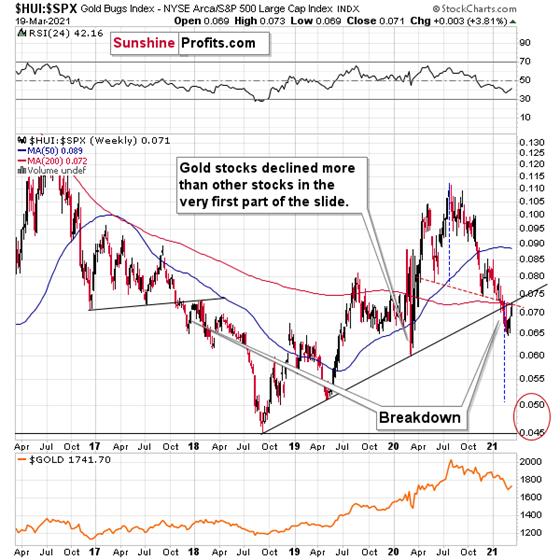
Whenthe line above is rising, it means that the HUIIndex is outperforming the S&P 500. When the line above isfalling, it means that the S&P 500 is outperforming the HUI Index. If youanalyze the right side of the chart, you can see that the ratio has broken below its rising support line. For context, the last time a breakdown ofthis magnitude occurred, the ratio plunged from late-2017 to late-2018. Thus,the development is profoundly bearish.
For further context, the ratio ismirroring the behavior that we witnessed in early 2018. After breaking belowits rising support line, the ratio rallied back to the initial breakdown level(which then became resistance) before suffering a sharp decline. And withtwo-thirds of the analogue already complete today – with the ratio rallyingback to its initial breakdown level (now resistance) last week – a sharpreversal could occur sooner rather than later.
In addition, because last week’s bouncewas merely a technical development, the HUI Index’s recent strength is nothingto write home about. What’s more, the early-2018 top in the HUI Index/S&P 500 ratio is precisely whenthe USD Index began its massive upswing. Thus, with history likely to rhymeagain, the outlook for the PMs remains profoundly bearish.
Moreover, please note that the HUI toS&P 500 ratio broke below the neck level (red, dashed line) of a broadhead-and-shoulders pattern and it verified this breakdown by moving temporarilyback to it. The target for the ratio based on this formation is at about 0.05(slightly above it). Consequently, if the S&P 500 doesn’t decline at all(it just closed the week at 3913.10), the ratio at 0.05 would imply the HUIIndex at about 196. However, if the S&P 500 declined to about 3,200 or so(its late-2020 lows) and the ratio moved to about 0.05, it would imply the HUIIndex at about 160 – very close to its 2020 lows.
In conclusion, with the miners’ recentconfidence likely to fade, it’s only a matter of time before they show theirtrue colors. With the USD Index raring to go and U.S. Treasury yields seeminglyexploding on a daily basis, the PMs recent move higher is akin to swimmingagainst a strengthening current: while they’re making progress, each strokerequires more and more energy. In addition, if a drawdown of U.S. equitiesenters the equation, the metaphor will be akin to swimming against a tsunami.The bottom line? Long positions in the PMs offers more risk than reward overthe next several weeks or so. However, once the medium-term climax is complete,it will be smooth sailing once again.
Thank you for reading our free analysistoday. Please note that the above is just a small fraction of today’sall-encompassing Gold & Silver Trading Alert. The latter includes multiplepremium details such as the targets for gold and mining stocks that could be reached in the next few weeks. If you’dlike to read those premium details, we have good news for you. As soon as yousign up for our free gold newsletter, you’ll get a free 7-day no-obligationtrial access to our premium Gold & Silver Trading Alerts. It’s really free– sign up today.
Thank you.
Przemyslaw Radomski, CFA
Founder, Editor-in-chief
Toolsfor Effective Gold & Silver Investments - SunshineProfits.com
Tools für EffektivesGold- und Silber-Investment - SunshineProfits.DE
* * * * *
About Sunshine Profits
SunshineProfits enables anyone to forecast market changes with a level of accuracy thatwas once only available to closed-door institutions. It provides free trialaccess to its best investment tools (including lists of best gold stocks and best silver stocks),proprietary gold & silver indicators, buy & sell signals, weekly newsletter, and more. Seeing is believing.
Disclaimer
All essays, research and information found aboverepresent analyses and opinions of Przemyslaw Radomski, CFA and SunshineProfits' associates only. As such, it may prove wrong and be a subject tochange without notice. Opinions and analyses were based on data available toauthors of respective essays at the time of writing. Although the informationprovided above is based on careful research and sources that are believed to beaccurate, Przemyslaw Radomski, CFA and his associates do not guarantee theaccuracy or thoroughness of the data or information reported. The opinionspublished above are neither an offer nor a recommendation to purchase or sell anysecurities. Mr. Radomski is not a Registered Securities Advisor. By readingPrzemyslaw Radomski's, CFA reports you fully agree that he will not be heldresponsible or liable for any decisions you make regarding any informationprovided in these reports. Investing, trading and speculation in any financialmarkets may involve high risk of loss. Przemyslaw Radomski, CFA, SunshineProfits' employees and affiliates as well as members of their families may havea short or long position in any securities, including those mentioned in any ofthe reports or essays, and may make additional purchases and/or sales of thosesecurities without notice.
Przemyslaw Radomski Archive |
© 2005-2019 http://www.MarketOracle.co.uk - The Market Oracle is a FREE Daily Financial Markets Analysis & Forecasting online publication.