Gold's Upcoming Plunge: The Powerful Analogies, Confirmations and Reasoning / Commodities / Gold & Silver 2019

 Gold,silver and mining stocks plunged on Friday and the yellow metal closed the weekbelow the $1,300 barrier. The gold-silver ratio soared once again and it allhappened in tune with our expectations, and despite the recent dovish commentsfrom the Fed. And – believe it or not – we have something much more importantand exciting about the precious metals sector to tell you today.
Rememberthe analogy between 2012-2013 decline and the current situation in gold,silver, and mining stocks? We featured it in the previous year and the entiresector appeared to be declining in tune with it. The last few months of 2018,however, along with the initial part of this year, seemed to have entirelyinvalidated this analogy. But did they?
Overthe weekend we dedicated a lot of time to analysis of the long-term charts andas we’re going to show you, it turns out that the analogy between 2012-2013plunge and the current situation is definitely in place, but we had beenearlier in the analogy than we originally thought. What we thought to be adecline similar to the late-2012 slide, was actually the smoothened version ofthe early-2012 decline. The most recent upswing is just like the mid-2012upswing. And it seems to have ended.
Inthe previous months, we had described multiple long-term bearish factors, andthe recent few months of higher gold prices were in opposition to them, sosomething didn’t seem right. We now see what it was. It was the shape of thedecline and it’s starting point. Let’s take a look at gold’s very long-termchart for details.
Long-termView of Gold: The Analogies
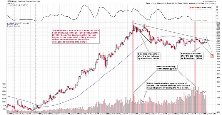
Thevery first few months of the 2018 were similar to the late-2012 decline, so itwas natural to start the analogy with these moves. As we now see, somethingelse fits the analogy better. The record-breaking monthly volume that we saw in2011 and in 2018 is something that starts an analogy that is confirmed bymultiple developments (and not only from gold) and the most recent upswingdoesn’t invalidate it. Conversely, it fits and confirms it.
Startingwith the record-breaking volume (marked with red rectangles), in 2011 we saw 9months of declines, and in 2018 we saw 8 months of declines. In both cases, wethen saw 4 months of higher prices and then a month where gold moved higheronly on an intraday basis, but declined in terms of the monthly closing prices.Both tops formed not too far from the previous high, but still below it. Thengold kept declining for several months.
Quiteinteresting so far, isn’t it? And we’re just getting started.
Thesimilarity is not only in price. The monthly volume readings areremarkably similar as well. When gold rallied in mid-2012, it did so ondeclining volume that increased in the final monthly upswing. It was exactlythe same case in late 2018 and in January 2019.
What about the shapeof the initial decline (late-2011 – early 2012) that was rather chaotic andvolatile compared to the stable nature of the mid-2018 slide?
Lookingat it with the benefit of hindsight, it’s easy to see why these moves weredifferent. It’s the question of what preceded them. In particular, it’s thequestion of what kind of volatility was present overall. The former move waspreceded by the parabolic upswing in gold prices and the top, while the latter was yet another (boring?) attempt torally above $1400, which ultimately failed. The volatility that was present atand below the former was very high and the volatility that was present at andbelow the latter was very low. Consequently, it’s normal and natural to expectthat the former decline would be volatile and chaotic, and the latter would becalm. This is normal, not something that breaks the analogy. You can check thevolatility levels by looking at the upper part of the above chart – it includesthe Bollinger Band width, which can be used as a reliable proxy for volatility.
Atthis time, the analogy is already quite remarkable, but not yet striking. But,as we explained earlier, we are just getting started.
Entergold stocks.
Lessonsfrom the Gold Stocks

Themost important thing about the above chart is that gold stocks have beenunderperforming gold for months. There were some local and temporary signs ofstrength, but overall, please note where the HUI Index topped when gold madeattempts to rally above $1,400. The 2016, 2017, 2018, and the most recentattempts of gold to move much higher failed at more or less similar levels.There were differences, but they were not huge, and you can see it on theprevious chart. Now, where did the HUI Index top on those occasions? At about280, then at about 220, then at about 210, and finally at about 180. Littledifference in gold and the HUI Index is about 100 index points lower. We sawsomething similar only one time in the recent past – between late 2011 and late2012. That’s a major confirmation of the grand analogy that we outlined ingold.
Butwait, there’s more. There are also detailed confirmations.
Wepreviously wrote that the recentmove higher in the mining stocks was similar to what we saw during previouscounter-trend rallies that were just pauses in abigger decline. The bearish implications thereof remain up-to-date, but there’smuch more to this upswing than just that.
Whatexactly happened in early 2012 in gold miners, when gold was moving to itsrecent lows? Miners broke below their recent lows and declined quitesubstantially. What happened in mid-2018? Exactly the same thing. We saw abreakdown and a sharp decline. In both cases, the price bottomed and ralliedback up only to then decline once again, almost touching the recently formedlow. It then reversed and rallied in a sharp manner – again in both: late-2012and in late 2018.
Inboth cases the rally continued until miners moved a bit above: the 50-weekmoving average (marked with blue), the previous lows, and the declining redresistance line. Moreover, in both cases miners topped slightly below theirmost recent high (the early 2012 high and the mid-2018 highs).
Theabove makes the analogy remarkable, and there’s still more to come.
Inboth cases, RSI and Stochastic Oscillator indicators moved from low levelsto high levels. In particular, the Stochastic indicator moved from the buysignal to an extremely high values (which had not been seen for many months)before flashing its sell signal.
Thatwas the very start of the carnage. A repeat of the 2012-2013 performance in theHUI Index points to a move below the 80 level. Crazy? It’s based on what hadalready happened (the size of the decline), so we shouldn’t be surprised to seethese levels. In fact, let’s keep in mind that when the HUI Index was toppingclose to the current price levels in 2015, gold was trading about $100 lowerthan it’s trading right now. Consequently, unless there is a major shift in thegold miners to gold ratio and the miners start showing substantial strength,gold’s move to just about the 2015 lows is likely to result in a breakdownbelow the 2015 lows in the mining stocks. Therefore, the implications right noware even more bearish than they were previously. Yes, the chart was extremelybearish, but it seems that it was not bearish enough.
Now,with gold at about $1,050 and gold miners at about 80 or so… What will theminers do if gold slides below $1,000 and bottoms (likely in a very volatilemanner) at about $890? The implications are almost unthinkable. We marked ahuge area from the 2000 bottom all the way to the 60 level. Yes, it is possiblethat gold miners would reach it based on what we wrote above, and – if – theanalogy to the 2012-2013 is upheld.
Usually whilediscussing very distant and bearish goldprice predictions, we receive messagesin which we read that gold price cannot go below its cost of production.Overwhelming majority of the gold ever mined remains on the ground andaccounted for. Gold is not consumed as a regular commodity and we can’t baseits price discovery on the supply and demand dynamics. Consequently, we would like to –right away – explain that this is not how things work with regard to gold’s production cost. Quoting the key part of ourexplanation in the Dictionary section:
Some analysts claimthat gold production costs constitute the floor for the gold prices. They arewrong. Gold is not like other commodities which are burned or eaten.If their prices plunged below the costs, production collapses. The fallingsupply and rising demand (due to low prices) help the prices to recover. Butthat mechanism does not work with gold, as the yellow metal is not burned oreaten. It is hoarded. So when the production falls, the supply of gold does notdisappear. Remember that there are massive above-ground holdings of gold. Theirpresence implies that the link between the production costs and prices israther weak.
If at all, it isreversed: gold production costs follow the prices. When the price of the yellowmetal increases, mining companies will invest in more sophisticated methods toextract gold and will start to operate deeper mines or lower quality ores,boosting the production costs.
Andyou know what? It’s still not everything that confirms the analogy between nowand the 2012-2013 decline.
Entersilver.
SilverConfirms
Thelink starts with the big-volume reversal where silver failed to break above the50-week moving average (marked with blue). That took place in early 2012 and inmid-2018.
Thensilver declined in a quite regular way and bottomed in a very specific way.There was an initial bottom that was followed by a comeback more or less to the10-week moving average and then the final bottom close to the first bottom. In2012, this important support was provided by the late 2011 lows, and in 2018,the support was provided by the 2015 lows.
Silverbottomed, and on both occasions, it moved higher in a rather weak mannerinitially, only to catch up with vengeance later on. It completed the rallyafter breaking above its 50-week moving average and it topped approximatelywhen the 10-week moving average broke above the 50-week moving average. Suchsituation in the moving averages is called the goldencross and the above is yet another example of why this (supposedly bullish) techniqueis rather useless in case of the precious metals market.
Whatmay be concerning is that silver formed a triple top in 2012 and early 2013before plunging, so if the analogy is to continue, then should we expectanother two tops?
No,because we have already seen them.
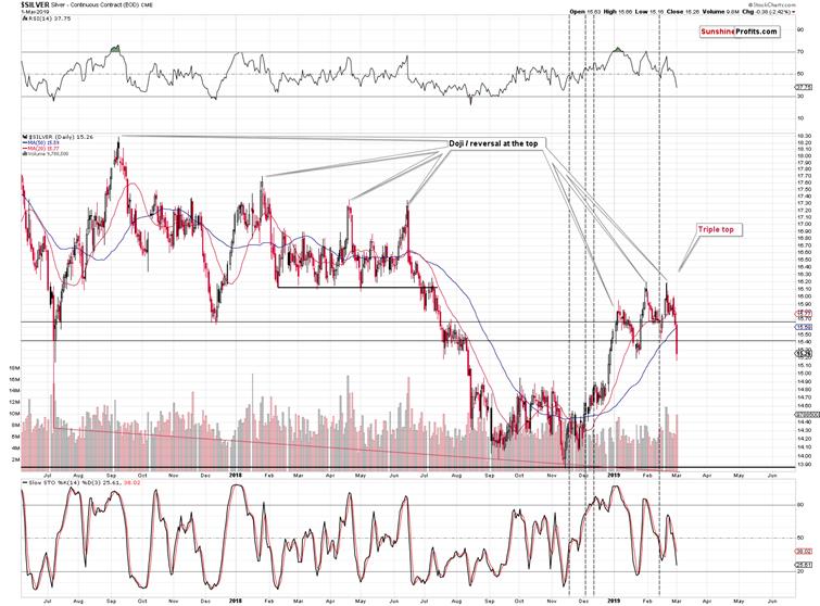
Silvertopped three times this year and it appeared to be breaking higher, and… It’salready at new 2019 lows in today’s pre-market trading. It’s likely to eraselate-2018 gains relatively soon, just like we discussed in the previous Alerts.
Thetriple top may also be viewed as a head-and-shoulders top, and its implicationsare bearish regardless of whether we view it as the former or the latter.
Theentire similar pattern that we marked on theprevious long-term silver chart is bigger than the current one, so it’s notthat surprising to have the three tops closer to each other now than they werein 2012 and 2013.
Thenumber of confirmations and similarities is astonishing. The implications areextremely bearish. And this is the case even without taking into account theinvalidation of silver’s breakout above the long-term resistance line andmultiple long-term signals from other markets that we have featured previously,and that we will update in our following analyses.
Asfar as silver is concerned, the above analogy implies a move back to the 2008bottom. This projection means silver not only below $10, but below $9. Silverat about $8.90 and gold at about $890 means the gold to silver ratio at about100, which is exactly what we expect to see in case of the ratio in thefollowing months. That’s where the true long-term resistance is – not at thecurrent levels.
Let’snot forget about the price analogy to the 2008 bottom. We marked it (orangelines and ellipses) on silver’s very long-term chart a long time ago, and itremains up-to-date. The starting points and the size of price moves have beenalmost identical to the 2007-2008 performance and also to the 2015 one – andnow the price is on the move. There is no analogy in terms of time, but the onein terms of price remains very strong. In 2008, silver bottomed at $8.40. Thisprice is unthinkable at this time, but it was just as unthinkable in 2008, whensilver was above $20. And it still declined to this level.
Thefirst shock to most silver bulls will take place when the white metal breaksbelow the 2015 bottom and they can no longer repeat the mantra that the finalbottom had been in. Many people will drop their investments at that time andthe decline would likely quickly accelerate on its downward path. The nextsupport levels are close to the $12 level. Perhaps this level will correspondto $1,050 in gold or perhaps it will correspond to a higher gold price – it’sunclear at this time.
On a side note, we aresilver bulls as well, but we think that silver needs to first plunge beforestarting its profound rally that will take it well above 2011 highs. The PMs bear market has to end first – and weknow how bear markets tend to end: with fear and blood in the streets.
Summary
Summing up, it’s almost certain that the next bigmove lower has already begun and that the 2013-like slide is in its earlystage. Based on the updated version of the 2013-now link, the implications areeven more bearish than we had initially assumed. The downside target for goldremains intact ($890), but it seems that the price moves in silver and miningstocks will take them even lower than we had originally thought. A move below$9 in silver, and a move to or below 80 in case of the HUI Index (perhaps muchlower on a very temporary basis) are not out of the question.
In other words, the preciousmetals market is likely to erase everything that it had gained in the lastseveral days, weeks, and months, and then decline much more before THE bottomis in.
We hope you enjoyed today’sanalysis, and we encourage you to sign up for our free newsletter. You’ll beupdated on our free articles on a daily basis, and you’ll get access to ourpremium Gold & Silver Trading Alerts for the first 7 days as a startingbonus. And yes, it’s free. Sign up today.
Thank you.
Przemyslaw Radomski, CFA
Founder, Editor-in-chief
Toolsfor Effective Gold & Silver Investments - SunshineProfits.com
Tools für EffektivesGold- und Silber-Investment - SunshineProfits.DE
* * * * *
About Sunshine Profits
SunshineProfits enables anyone to forecast market changes with a level of accuracy thatwas once only available to closed-door institutions. It provides free trialaccess to its best investment tools (including lists of best gold stocks and best silver stocks),proprietary gold & silver indicators, buy & sell signals, weekly newsletter, and more. Seeing is believing.
Disclaimer
All essays, research and information found aboverepresent analyses and opinions of Przemyslaw Radomski, CFA and SunshineProfits' associates only. As such, it may prove wrong and be a subject tochange without notice. Opinions and analyses were based on data available toauthors of respective essays at the time of writing. Although the informationprovided above is based on careful research and sources that are believed to beaccurate, Przemyslaw Radomski, CFA and his associates do not guarantee theaccuracy or thoroughness of the data or information reported. The opinionspublished above are neither an offer nor a recommendation to purchase or sell anysecurities. Mr. Radomski is not a Registered Securities Advisor. By readingPrzemyslaw Radomski's, CFA reports you fully agree that he will not be heldresponsible or liable for any decisions you make regarding any informationprovided in these reports. Investing, trading and speculation in any financialmarkets may involve high risk of loss. Przemyslaw Radomski, CFA, SunshineProfits' employees and affiliates as well as members of their families may havea short or long position in any securities, including those mentioned in any ofthe reports or essays, and may make additional purchases and/or sales of thosesecurities without notice.
Przemyslaw Radomski Archive |
© 2005-2019 http://www.MarketOracle.co.uk - The Market Oracle is a FREE Daily Financial Markets Analysis & Forecasting online publication.