Why Gold Could Outperform The S&P By 8% Annualized Over The Next 10 Years
Average investor allocation to equities is an incredibly powerful predictor of equity and gold forward returns.
Equity allocation is currently higher than long-term averages.
Historic relationships suggest strong performance from gold on a 10-year forward basis.
Thesis
In this article, we decompose what we consider to be the most significant predictor of future gold returns (GLD); the average investor's allocation to equities. We will describe the basis for the predictor, its performance in the past, and what it projects for the future. We will assess the same predictor's performance against the S&P500 (SPY). These twin assessments will support the article's nameplate; Why Gold Could Outperform the SPX by 8% Annualized Over the Next 10-Years.
Market commentary generally revolves around heuristics; gold prices increased because of geopolitical turmoil, or changes in interest rates, or inflation risks or, or, or. This article's focus is something else entirely, factors intrinsic to the structure of the marketplace; supply and demand and the flow of capital.
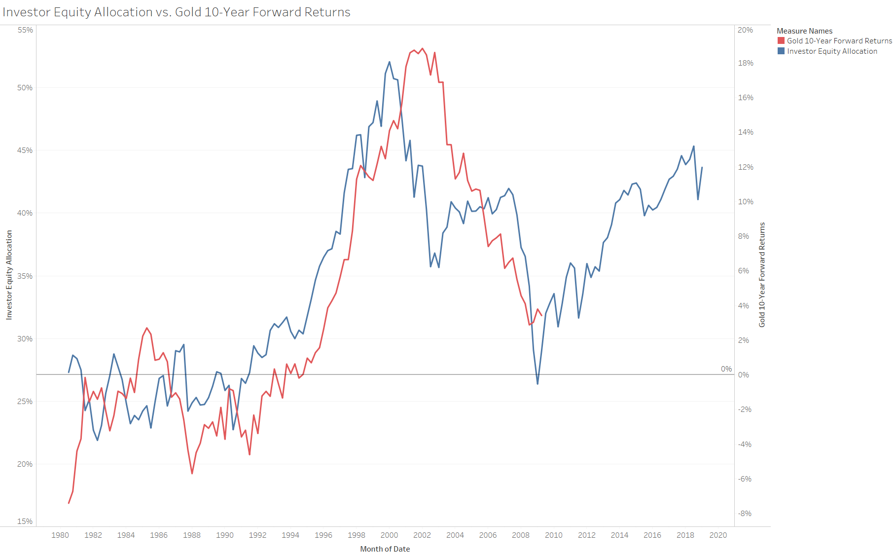
Source: Resource Skeptic chart, FRED data, LME gold prices
Inspiration
Before getting into the details of this assessment, I must highlight where the inspiration for this article originated. The anonymous author Jesse Livermore wrote a brilliant piece in 2013 which delved into the most powerful predictors of stock market returns. His analysis demonstrated that the average investor allocation to equities was more predictive of future returns than P/E ratios, Shiller Cape, and Equity Q. This article reflects my attempt to understand Jesse's work and expand his analysis to precious metal prices.
The Predictor (The Average Investor's Allocation to Equities)
Jesse describes, in detail, how to arrive at the total amount of cash + bonds + equities in investor portfolios. With this information in hand, we can calculate the average investor's allocation to equities (total equity market cap / financial assets from all sources). Lucky for us, FRED actually does this work for us and reports on the figure. The reader should highlight that the average equity allocation percentage has hovered around 35% over the past 70 years and has reached as high as 52% (in January 2000).
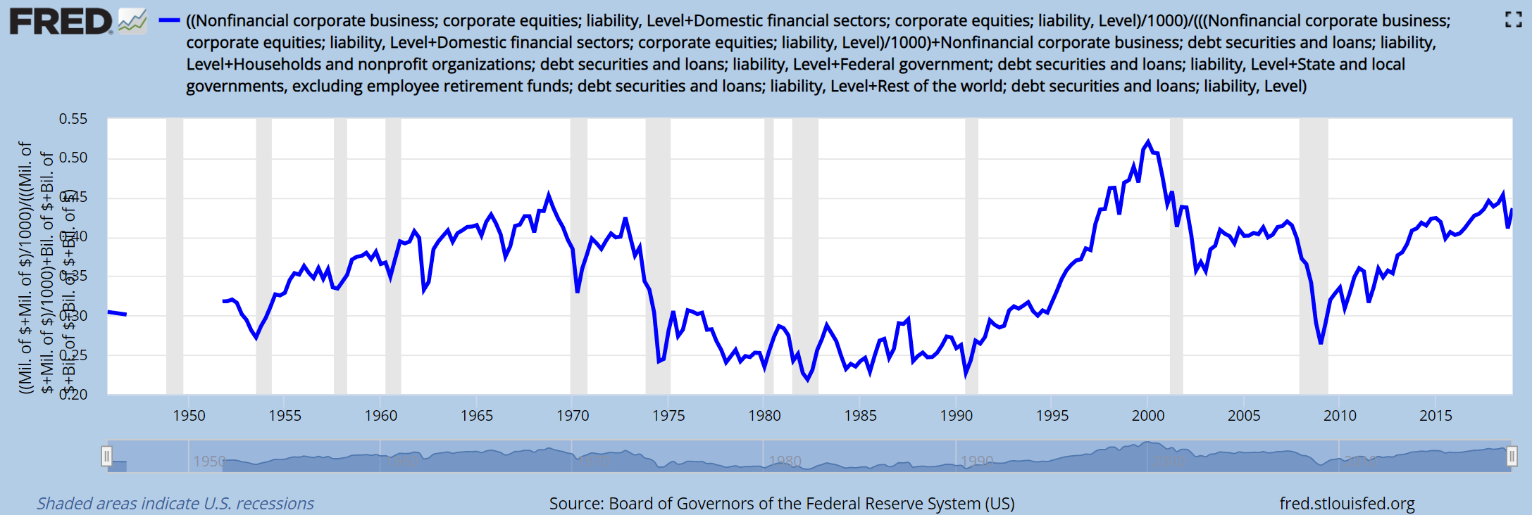 Source: FRED
So Why Does this Matter For Gold?
It's interesting that Jesse's article excluded any talk of commodities or gold. In his defense, the precious metals market is a rounding error when looking at aggregate financial assets. This doesn't mean, however, that this information is irrelevant for metal investors. Gold is held in investor portfolios, just like equities, bonds, and cash. It stands to reason that investor preferences associated with these base assets should influence behavior with other alternative allocation options -gold-. With this in mind, let's look at some historic relationships to see if there are any useful trends.
Before we start the gold assessment, it's worth revisiting the relationship between the average investor allocation to equities and 10-year forward SPX returns. The charts are incredible; R2 of the scatterplot is 85%. Average allocation to equities is and continues to be an incredibly powerful predictor of future stock market returns.
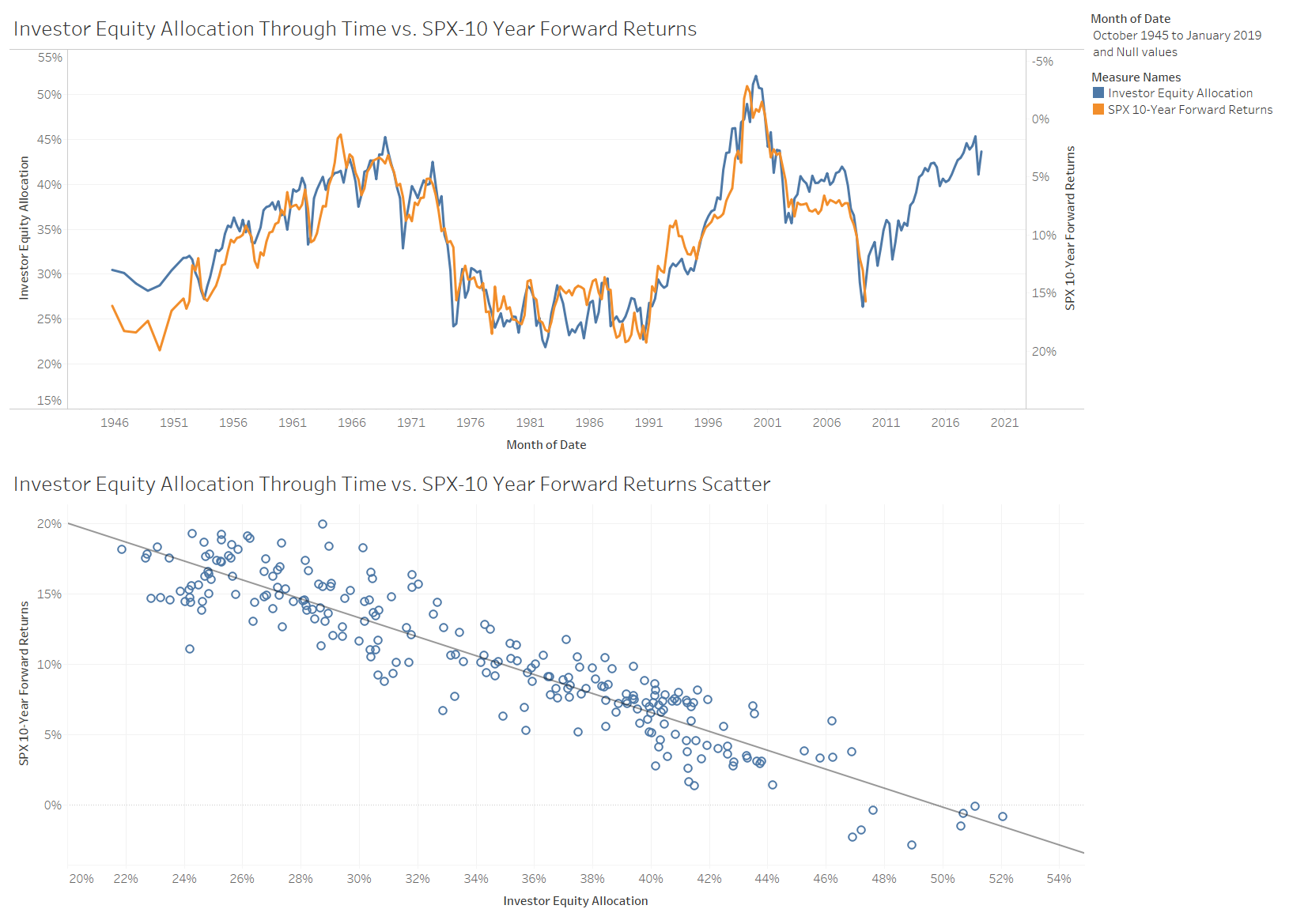 Source: Resource Skeptic chart
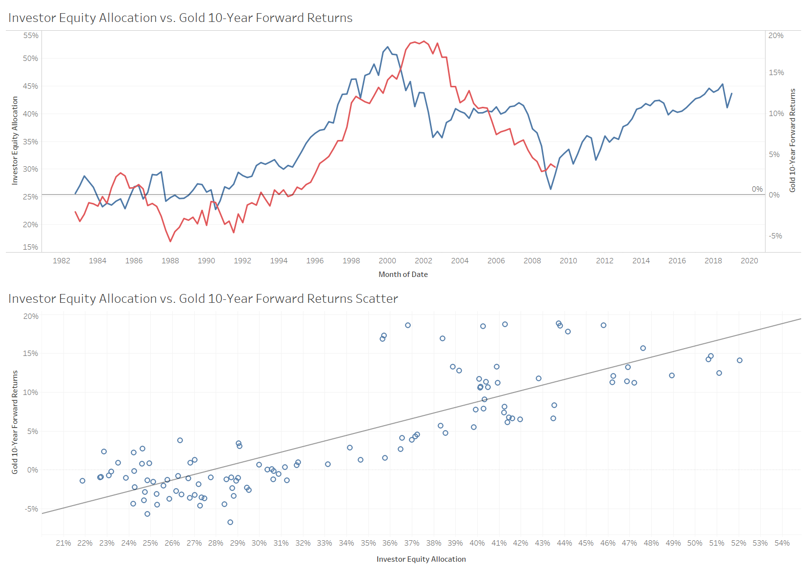
If we overlay this same equity allocation data with gold price forward returns we get the following chart which, interestingly, is the complete inverse of the SPX relationship. Gold forward returns are actually positively correlated with equity allocation. The relationship, albeit less robust than the SPX comparable, is still very strong with an R2 of 70%.
Boiling This Down to Actionable Insight
The data shows that when equity allocation is high, future SPX returns are low. The inverse is true for gold, when equity allocation is high future gold returns have been high. This relationship is reasonable and intuitively understandable. When the allocation to equities falls back to historic levels, the money has to flow somewhere; it appears that gold is one of those locations.
As of January 2019, the FRED data shows that the average equity allocation totaled 44%. The SPX-10 year forward return scatterplot projects a 4% 10-year compounded annual return. The gold 10-year forward return scatterplot projects a 12% annual compound return.
Conclusion
This article delved into average investor equity allocation and assessed the impacts on 10-year forward gold and SPX returns. Historic probabilities indicate that gold could outperform the S&P500 by 8% per year over the subsequent 10-years.
Caveats
When thinking about gold, it's often easy to forget that it actually hasn't existed in a free market for a long time. I limited the analysis to 1982 and onward as price performance prior to this time was very erratic as gold became free floating. While the scatterplot R2 is quite high for gold, it's worth considering that there have only been 3 (or 4) economic cycles over this assessment period. Yearly data, while informative, may overstate the statistical validity of these relationships.
This is not investment advice.
Disclosure: I am/we are long GLD, SPY. I wrote this article myself, and it expresses my own opinions. I am not receiving compensation for it (other than from Seeking Alpha). I have no business relationship with any company whose stock is mentioned in this article.
Follow Resource Skeptic and get email alerts